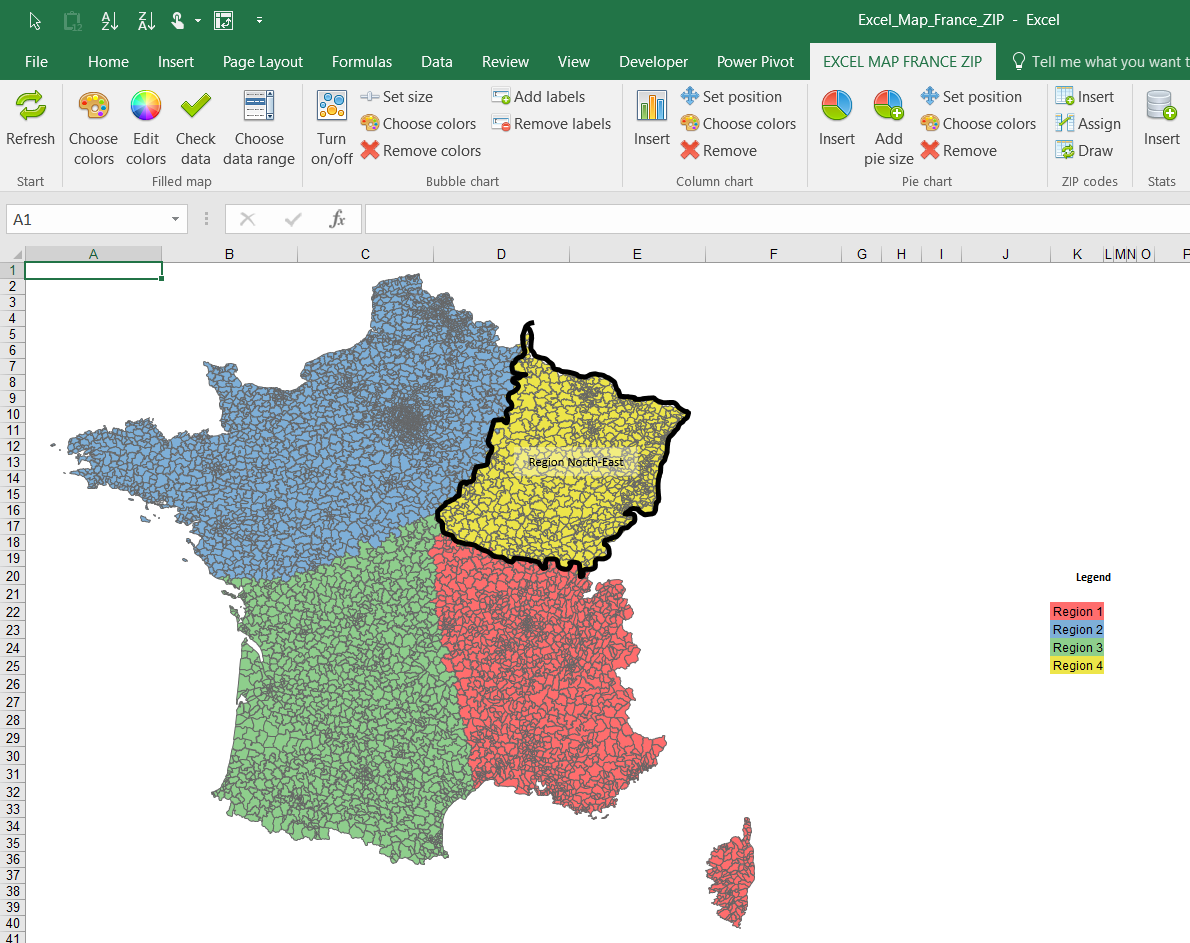
Filled map functionality of the Excel Map allows user not only to differentiate the shapes colors by values (which is sometimes called a choropleth map) but also to color them by categories. Using Excel Map France Postcodes (Code Postal) I will show you how to create your own regions.
Prepare the data for the Excel Map
You need to start with preparing the data to be shown on the Excel map. In the example of France I have region names and numbers (Region 1, Region 2, etc.) assigned to French Postcodes.

Next using any text function assign integer numbers in column G of the Map sheet. You could use for example a text function (like RIGHT) and VALUE function to convert the text into a value (only numbers 1,2,3,4,…,30 are applicable).

Draw the data on the Excel Map
Having this done, we can design color palette for our regions. On the Excel Map Ribbon go to Filled map group > Choose colors > Categories colors.
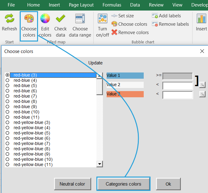
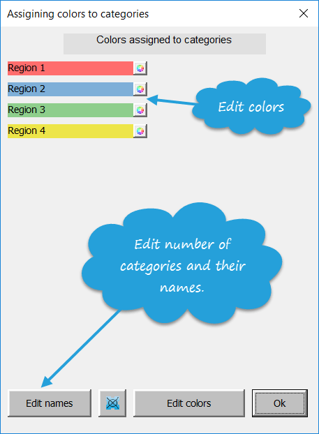
Then edit number of categories, their names and colors and click OK. It may take while do refresh the map depending on the number of shapes and the number of categories.
Edit your Excel Map
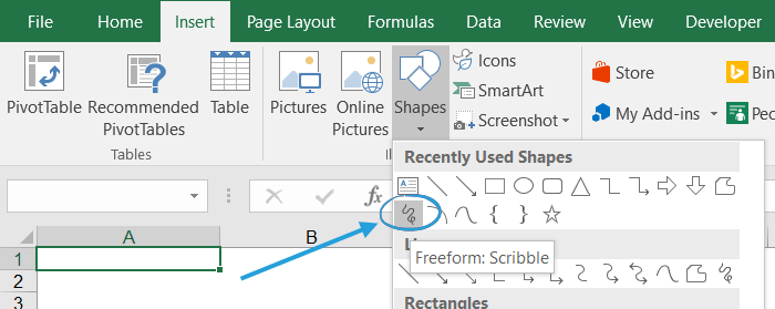
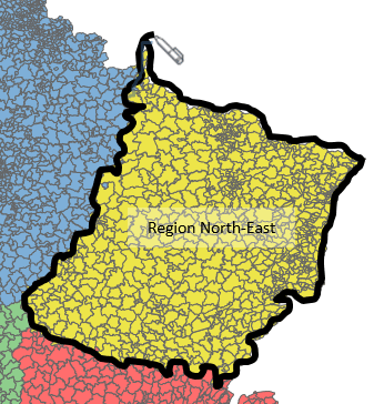
Because the map is a bunch of Excel shapes, you can easily add new shapes to the map like contours of your new regions. What is more, you can attach simple text labels to your map or use Add label functionality to have this done by the software.
Watch a step-by-step video tutorial on regions in Excel Map


