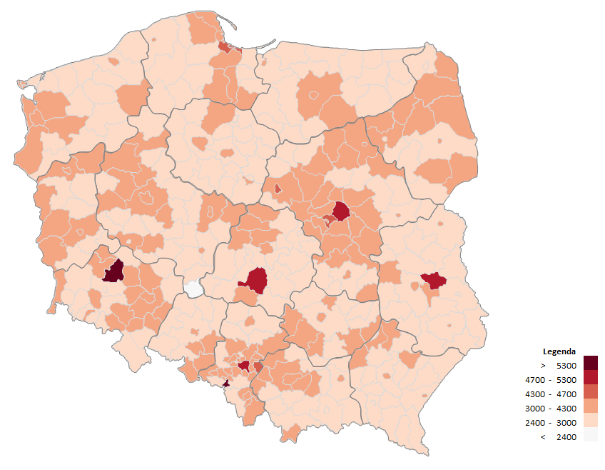
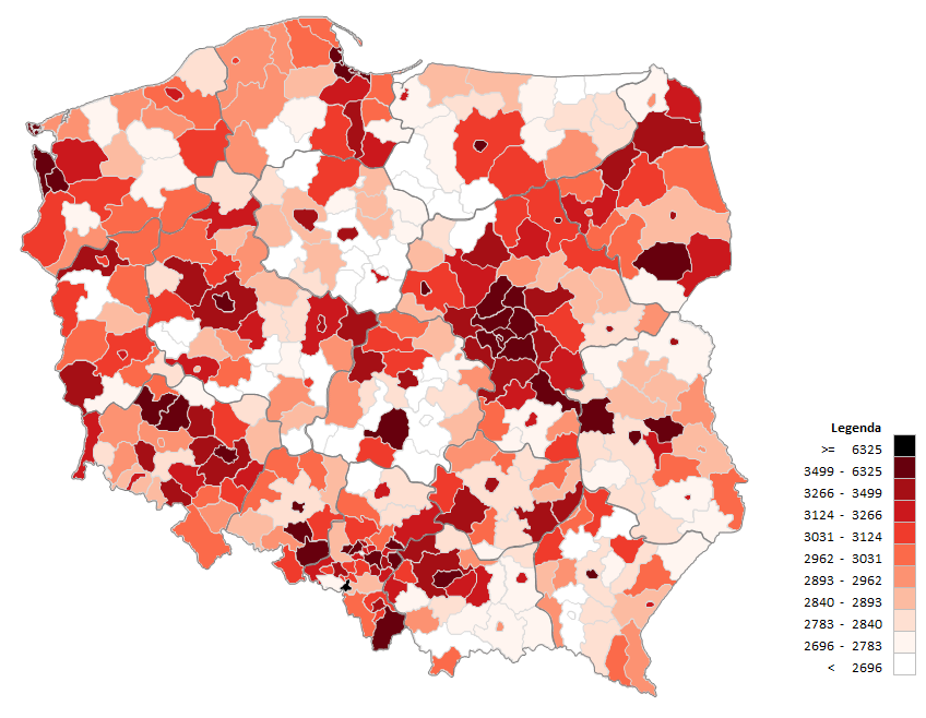
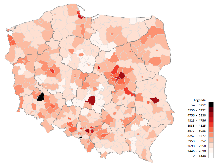
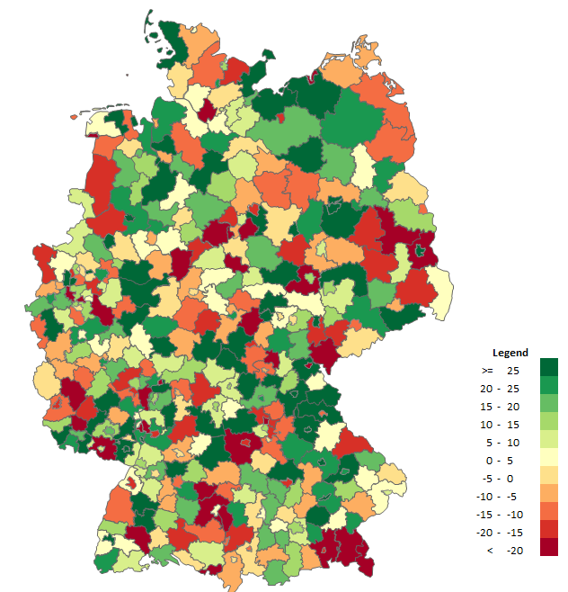
 The choropleth map is a chart presenting phenomena on the map and is one of quantitative methods in cartography. Intensity of a given phenomenon is displayed within defined reference areas, the most often of administrative division, e.g. provinces, municipalities/communes or districts, and the magnitude of the phenomenon is presented in classes (ranges).
In order to prepare a choropleth map one must collect and process data concerning respective areas, determine their classes and prepare the choropleth map graphically. The advantages of a choropleth map are:
– simple to prepare – just colour the map,
– easy perception – the colour makes it easy for everybody to see the differences between areas,
– analytic abundance – many types of data placed in one picture in a comprehensible way.
Using a choropleth map can lead to erroneous conclusions due to its disadvantages:
– large areas of intensive colour draw more attention as a result of their size, rather that the numbers defining the phenomenon,
– lack of diversity of a phenomenon within an area creates the impression that it is uniformly spread within one space,
– determination of classes has significant impact on the final result, which creates a risk of manipulation.
Optimally, the data for a choropleth map should be relative (expressed in the form of a coefficient) related to the whole area of a territory specified on the map, but it is not prerequisite. An example of relative data related to the whole area of a basic field is density of population (number of inhabitants / km²).
Preparing a choropleth map based on the map we must choose the level of detail. From the perspective of a province the presented data will be general, from the perspective of communes/municipalities the picture will be very detailed.
When determining classes of a choropleth map one must specify their number and limit. The simplest choropleth maps have only two classes. In most cases 5 to 11 ranges are used. An initial stage of determining ranges is the analysis of distribution of data. In most cases a histogram or value chart is prepared for this purpose.
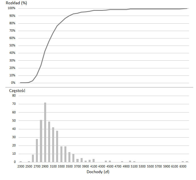
Let us try and analyse the distribution of a medium income per one district inhabitant by checking how the method of selecting classes will affect the graphical image. For this purpose we prepare a distribution (the upper line chart) and a histogram (the lower column chart). The upper chart shows what percentage of districts (do not confuse with people – districts have different numbers of inhabitants) have income above a certain amount (e.g. 90% have income below PLN 3500), the lower chart shows how many districts have specified income (in PLN 100 ranges). A choropleth map can be created with 4 most popular methods.
Discontinuity method
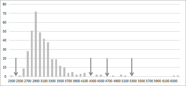
When data values arranged in ascending or descending order are put on the chart, discontinuities can sometimes be noticed. The drawing below shows such places marked with an arrow fairly clearly.
Discontinuities, called characteristic points, can function as class limits, as they indicate natural deflection of a set of observations. In the example, beside the points marked with an arrow one additional point is added in order to separate values on the left and right side of the histogram.
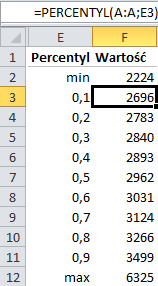
Method of ranges with equal number of observations
The general number of reference units (districts) is divided into the intended number of classes (11 in the example). Next, data arranged in ascending or descending order is assigned to proper classes. In practice one can use Excel functions of MIN, MAX and PERCENTILE, as in the example below (A:A is a data collection).
Method of ranges of equal scope
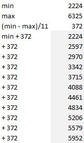
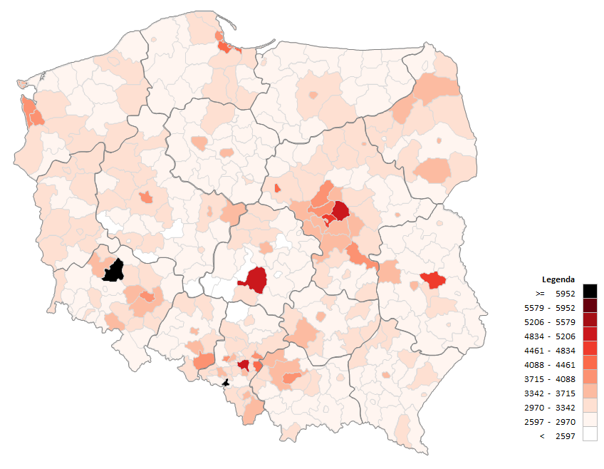
In this method all classes have the same scope. The difference between the highest and lowest values is divided by the number of classes (in the example divided by 11).
Geometric series method
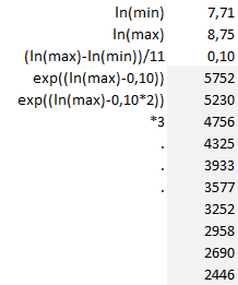
In this method each subsequent value can be obtained from previous values by multiplying it by the constant C, the series ratio. In order to define limits of classes with this method one must calculate natural logarithms of the highest and lowest values (Excel function LN). The values are then subtracted from themselves and divided by the number of classes, which gives the logarithm of the constant C. In the example the constant C was 0.1. Then antilogarithms should be calculated (Excel function EXP).
To sum up, the most important in creation of a choropleth map is correct matching of class ranges. Depending on the method a graphical image can be different which should be kept in mind when both, creating and reading such a chart. Irrespective of the method a choropleth map should emphasize values that are extreme and stand out.
The charts have been prepared using maps available in the Products section.


