The most important decision to be made when designing a filled map (professionally called a choropleth map) is to define colors classes. As the designer, you decide which value goes to which color. Your decision will have a great impact on what the audience will get from your map. Get to know 3 ways to find to classify your data.
Method 1: Equal size of intervals
This method is based on minimum and maximum (the co called range) of your data. In Excel Map you can calculate these values and then count equal intervals between them, depending on the number of colors you wish to use. The example is based on the population data for France.
Let’s put the population in the column G of the data sheet.

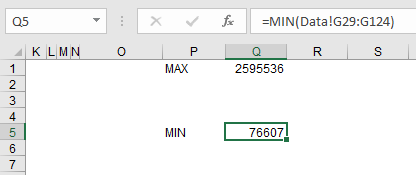
Then go to the Map sheet, pick a cell and calculate there the maximum value of your data.

Go down as many rows as you wish your legend to have colors and calculate the minimum value. My example is based on 5 classes.
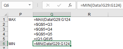
All final formulas will look like this:
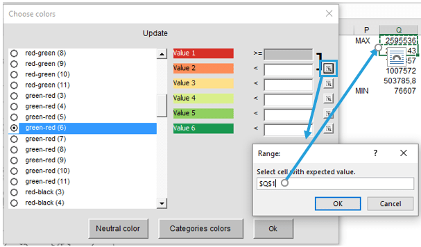
Once the values are calculated, you can use Choose color option and connect the classes with the filled map coloring.
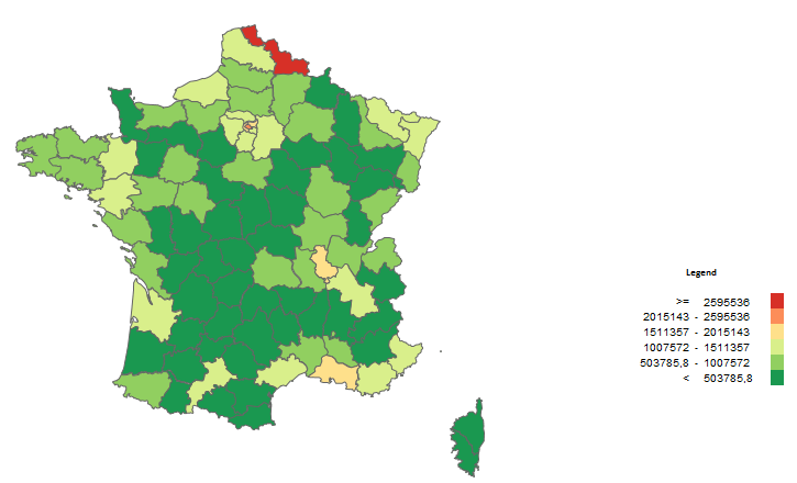
After refreshing the map, you will get a following result:
Method 2: Equal number of units in the interval (quantile)
In this method, we would like the groups to have the same number of administrative areas inside (e.g. 20 French departments per color). To prepare classes with this method you need to prepare a small table of k-values (e.g. 0,8; 0,6; 0,4…) and a formula to calculate percentiles based on this table.
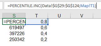
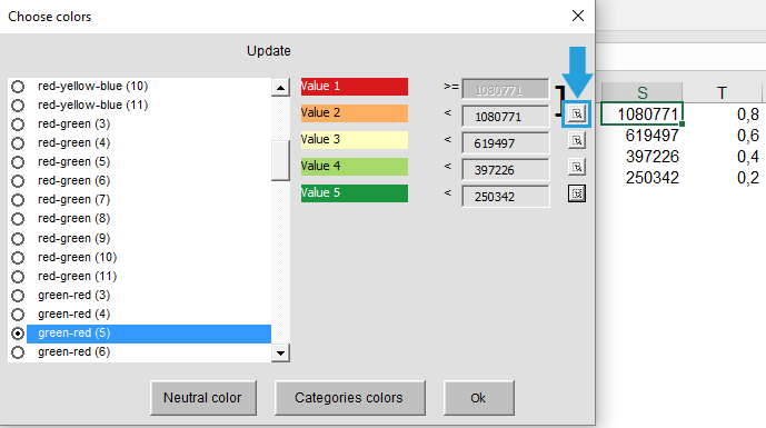
Again, we would like to connect color legend to this values by using Choose color option.
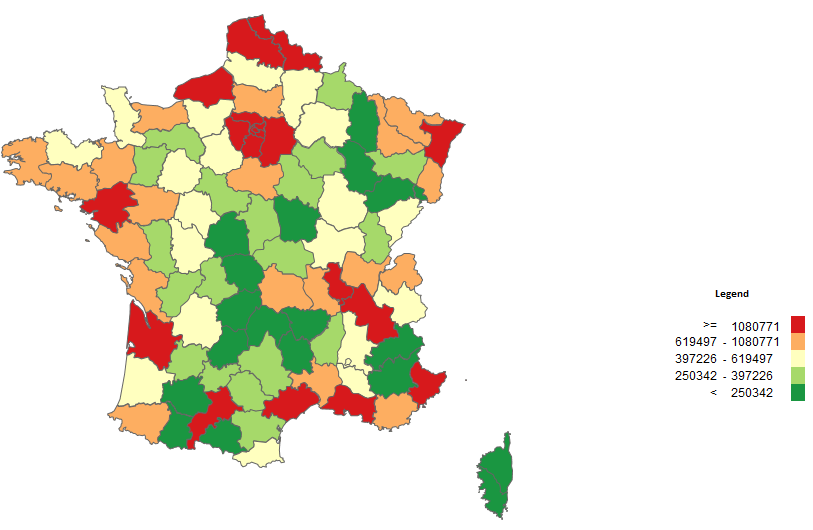
The final map will look like this:
Method 3: Round numbers
In both previous methods, the classes work fine but they don’t look good on the legend. Similar to chart axis labels, where we usually try to show big rounded numbers (like 1000, 1500, 2000 etc.) we can try to use the results of the 2 previous methods and adjust the legend a bit.
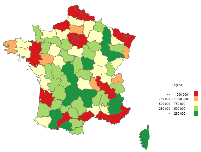
In case of France population data, we can try a few combinations that will look good and tell the truth about the data. To keep consistent with the previous example I will use following classes:

Watch the video tutorial to learn how to use the Excel Map


