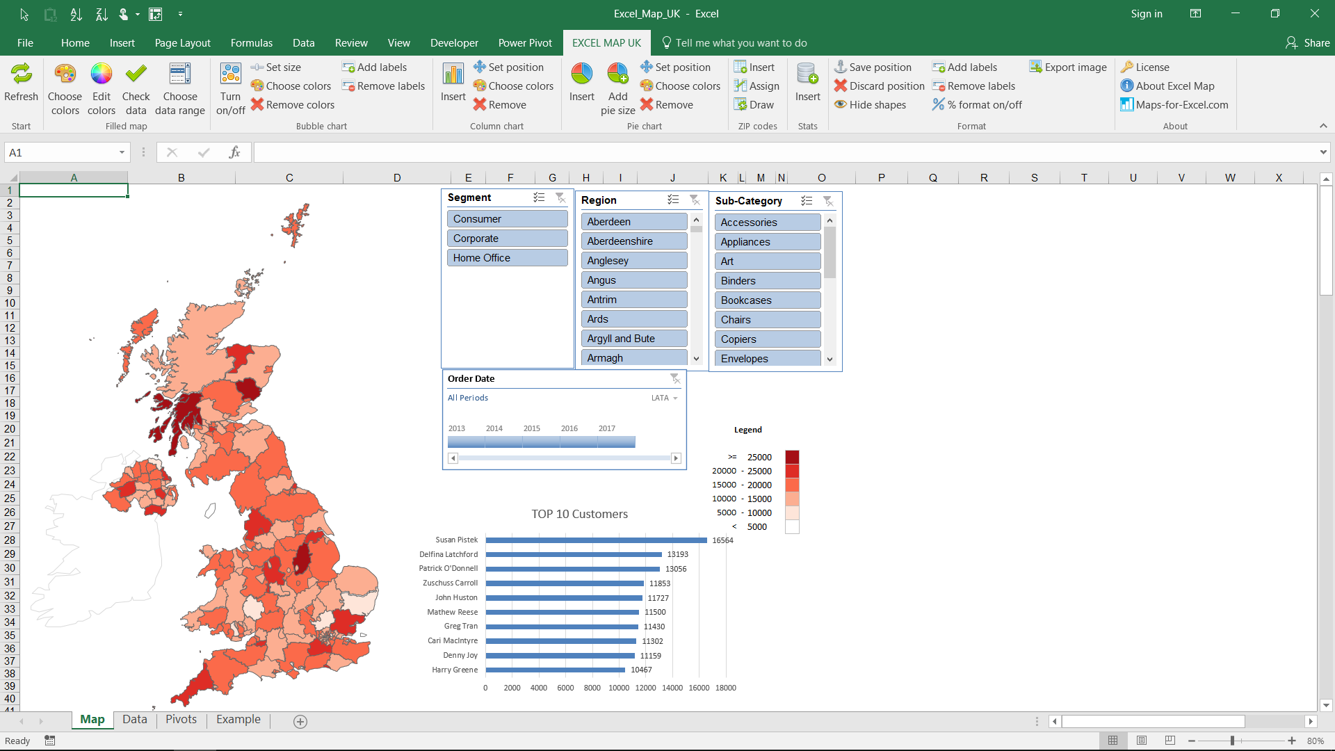
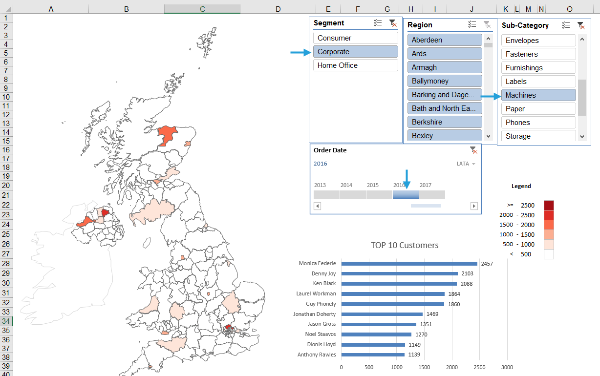
A dashboard is usually a collection of charts and tables combined with interactivity for the end user. Excel Map software allows the user to easily create interactive dashboards using pivot tables and slicers. This example is based on a Excel Map UK but can be applied to any of the maps.
Prepare the data in a pivot table
The starting point is a table with sales data. It usually contains some order dates, sales amount, categories, customer names etc. Based on this data let’s insert a pivot table into the Map sheet.
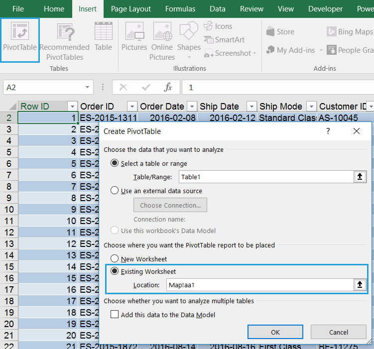
It is crucial that this pivot table exists in the Map sheet because only then the auto refresh of the map will work.
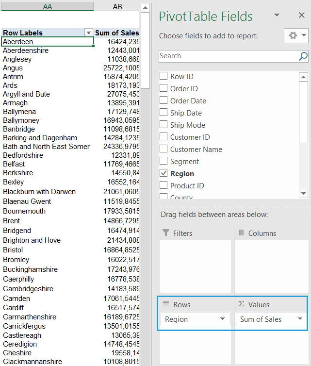
Once we have the table, we define Regions as Rows and Sales as Values. It is necessary that the region names are consistent with the names that you can find the Data sheet. If not you need to correct that before creating a pivot table or create a new column in the source table and refresh the pivot table.
Connect the pivot table with Excel Map data input
Then go to Data sheet and use IFERROR and VLOOKUP functions to connect Data sheet to the pivot table – for the UK map this would be like this:

Insert slicers to create interactive dashboard with a map
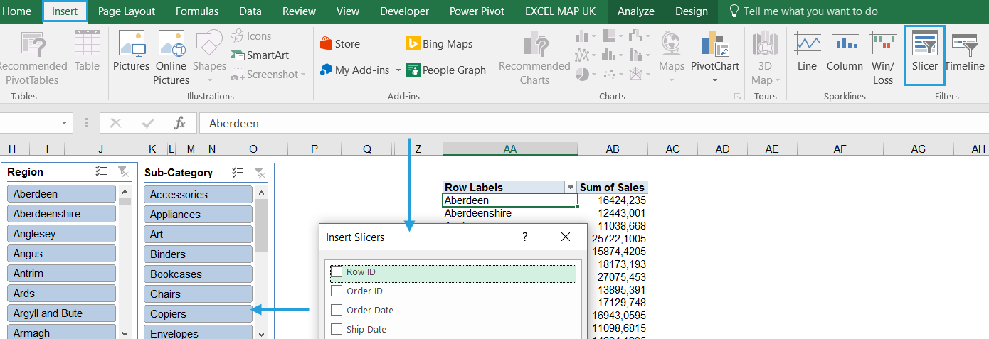
Next choose Insert tab > Filters > Slicer and choose the fields to become filters for your dashboard.
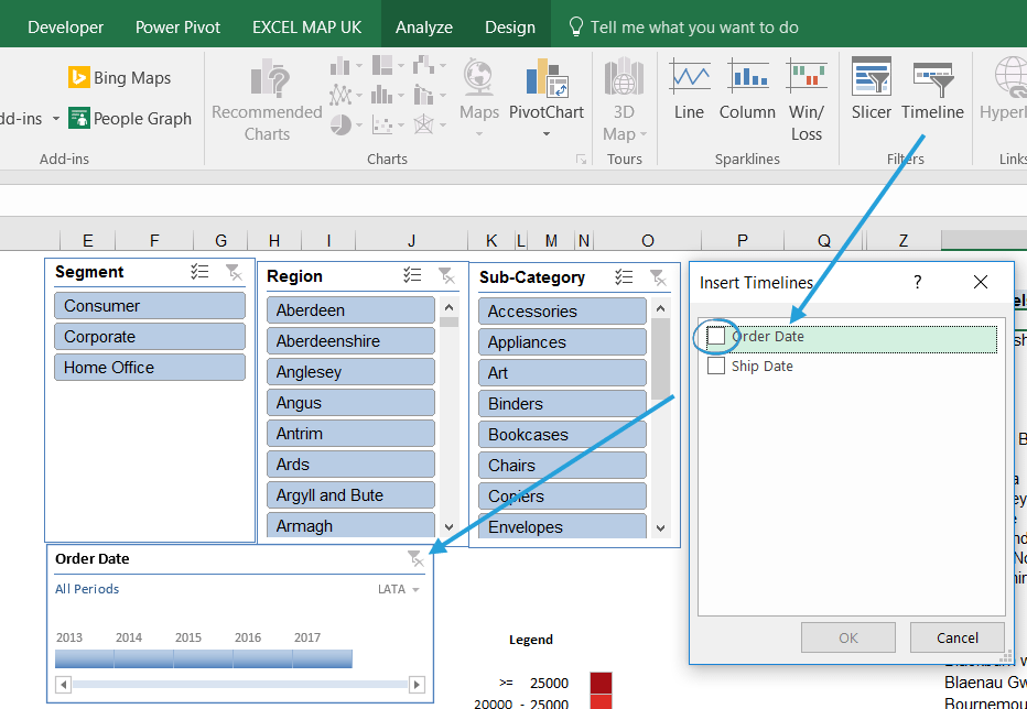
If your data contains date columns in the proper format and you are running Excel 2013+, you could also insert a timeline slicer, which is great to filter years and months.
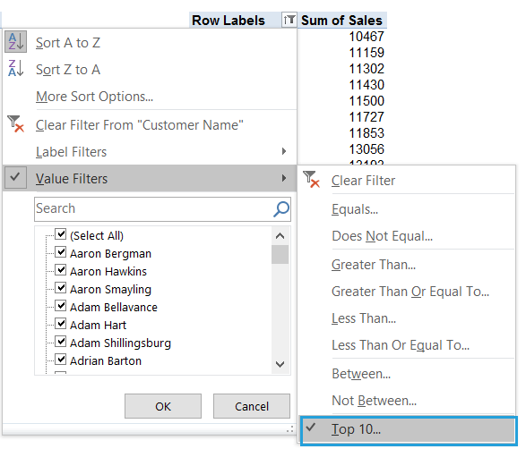
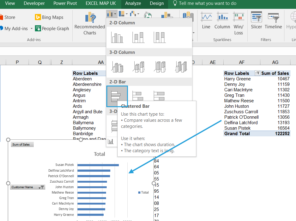
You can add more tables and charts by copying the existing pivot table – this way your slicers will be automatically connected to all new pivot objects (tables and charts). For example, you could create a pivot table showing Top 10 of your customers and turn it into a bar chart.
Design an interactive dashboard using pivot tables, charts & map
Now, using a slicer you select the data in both pivot tables and on the map. You could add more pivot tables and maps to give more perspectives on a dashboard.


