 Analysing data with regard to the place of occurrence of a phenomenon or process is inseparable from the cause and effect analysis.
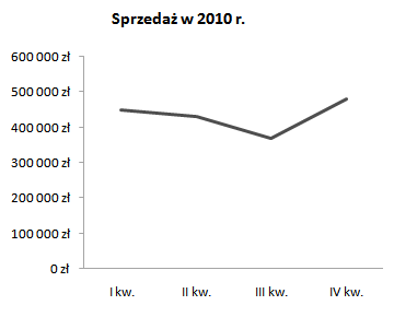
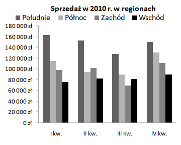
For example, when looking at sales results it is natural to examine first the aggregated sales results and their change overtime and then their division into sales regions and provinces. Line charts, column charts and small multiples are ideal for this type of comparisons.
The added value will be obtained if we present the data in connection with their place of origin joining two different worlds – abstract quantitative data (e.g. concerning sales) and physical geographical location. Quantitative data is abstract because the growing sales line (on the first chart) does not really exist and it was us who put the sales into a physical form of a chart. The abstract part is also the artificial divisions visible on the maps, e.g. borders of provinces. However the geographical information in the form of a map is the rendition of the physical characteristics of our world (distances, topography, road network, water areas).
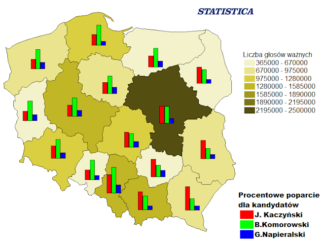
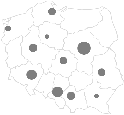
Many visual objects that present the data on charts (e.g. lines, columns and even more so the pie charts) do not prove themselves in practice, for they impede comparisons. In the following example (so-called proportional symbol map) the confrontation of column length is handicapped, perhaps with the exception of those close to one another.
Columns are effective when placed on a common base – human eye is then able to compare their length precisely against one another. As the column sets on the map are placed in different places it is impossible to compare them. Moreover, on many maps it is impossible to place multiple columns beside one another without their overlapping.
On the other hand, pie charts are not at all comparable with one another, so their application in a proportional symbol map gives more a general idea and constitutes the basis for further analysis.
The best method of data presentation on the map is using colour schemes (darkest/lightest elements put on display for the eye), various shape sizes (biggest elements put on display), or a combination of the two. The intention to add a bigger number of sizes (e.g. a product size) to a single map will make it difficult to understand, one must be careful then.
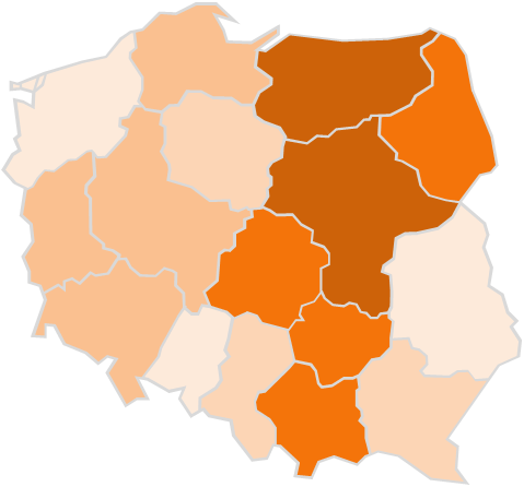
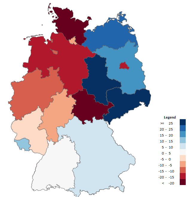
A colour palette proves to be effective for presentation of one-dimensional data divided into geographical regions. A map that is created this way is called a choropleth map. At the same time one should keep in mind one of the rules of the effective colour use: sequential colour scheme (in short, the darker the hue, the higher the values). When creating a choropleth map we have to be aware that with the same colour the bigger area will be perceived as more important by a recipient and that we assume that the arrangement of the variable is the same in a given region. Below is an example of a choropleth map of the sales result according to provinces:
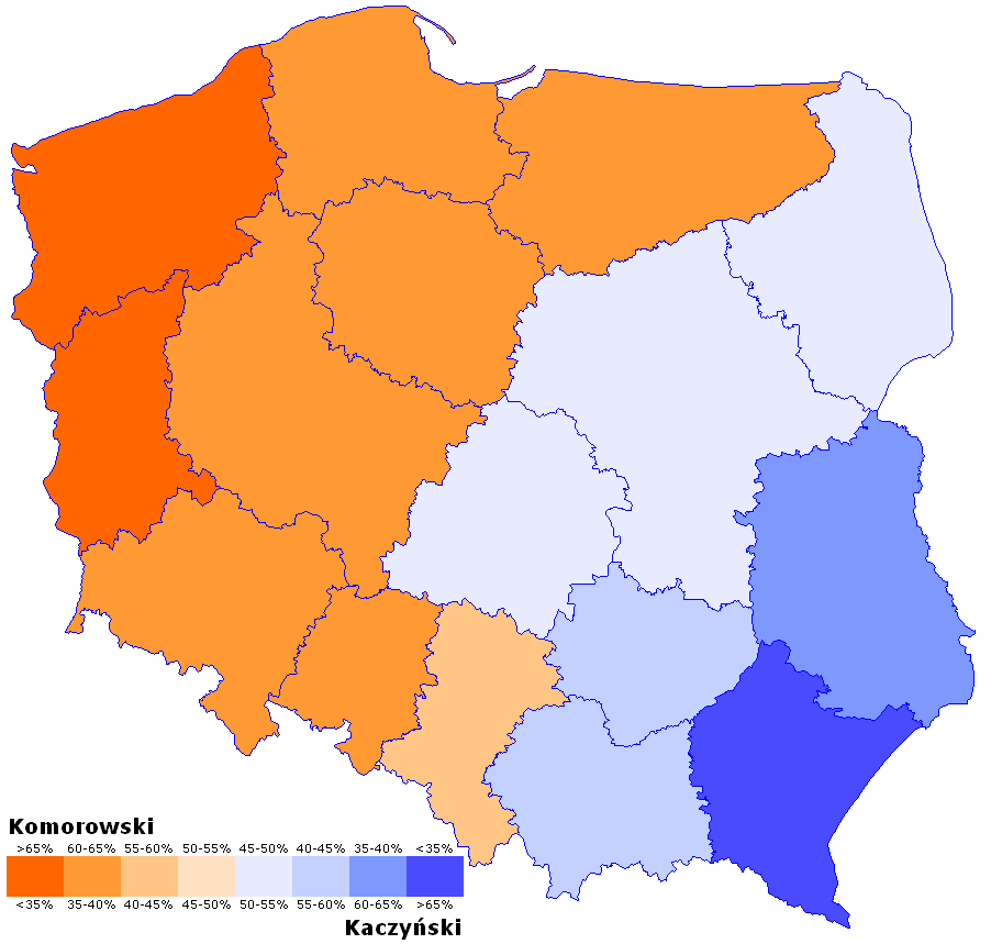
In some cases we can introduce an additional dimension by changing the sequential colour scheme into a diverging colour scheme. For example, we can present the results of the 2nd round of presidential election of 2010 in Poland divided into provinces and two candidates:
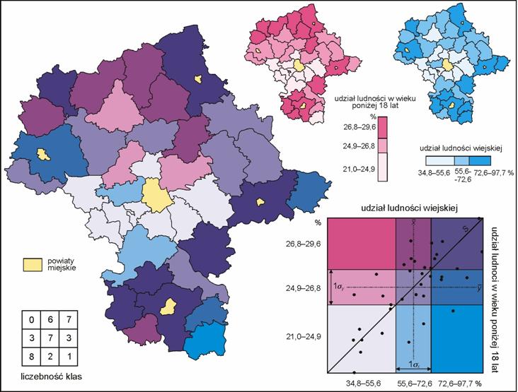
In contrast, addition to a choropleth map of an additional variable encoded in the form of a colour combination will result in it being illegible for an ordinary reader. It is illustrated by the example below – a combination of two choropleth maps.
Analysis of a double choropleth map is possible only through constant movement of the eyes between the map and legend, which impacts the message negatively. A better solution would be to put the two choropleth maps side by side and complement them with a table.
By introducing into the map various sizes of shapes that represent a ratio scale we mark the exact location of a phenomenon and its magnitude (e.g. profits achieved by sales outlets). This way we achieve a very high level of detail that cannot be seen on a choropleth map. Various shape sizes can be combined with a colour scheme, thus obtaining a general and detailed view at the same time.
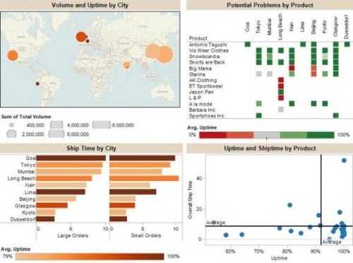
Quantitative data put on maps is in itself a very useful analytic tool. Nevertheless, effectiveness of a message can be multiplied by combining the map with other means of visualisation by creating an interactive analytic dashboard (as shown by an example below), that allows for quick filtering, comparing and selecting details. This way we can use the geographical data in full, thus discovering what, where and when (and perhaps also why) something happened.


