Skip to content
Facebook page opens in new windowLinkedin page opens in new windowYouTube page opens in new windowRss page opens in new window
Cart0

View CartCheckout

  • No products in the cart.

Subtotal: 0.00 €

View CartCheckout

Login
Cart0

View CartCheckout

  • No products in the cart.

Subtotal: 0.00 €

View CartCheckout

Login
Maps for Excel – Simple Excel Add-In to create filled maps & dashboards in Excel
Excel Map, Filled Map, Choropleth Map, Build Regions, Post Codes, Bubble Chart on Maps, Power BI
Maps for Excel - Simple Excel Add-In to create filled maps & dashboards in ExcelMaps for Excel - Simple Excel Add-In to create filled maps & dashboards in Excel
+48 500 196 861
contact@maps-for-excel.com
  •  
  • Products
    • Demo
    • Credentials
  • Free Mapping Video Course
  • Trainings
    • Art of Data Visualization & Dashboard Design
    • Excel BI for Analysts
    • Data visualisation and designing dashboards in Tableau
    • Power BI – create data model, design dashboard, share report
    • Certification
  • Services
    • Excel Maps, Geoanalysis, GIS System
    • Excel reports automation & design with VBA, Query & PowerPivot
    • Power BI & Business Intelligence
    • Reports, Analyzes & Infographics
    • Credentials
  • Blog
    • Newsletter
    • Resources
  • About Me
  • Contact
Search:
Search
Search:
Search
Search:
Search
Maps for Excel - Simple Excel Add-In to create filled maps & dashboards in ExcelMaps for Excel - Simple Excel Add-In to create filled maps & dashboards in Excel
  •  
  • Products
    • Demo
    • Credentials
  • Free Mapping Video Course
  • Trainings
    • Art of Data Visualization & Dashboard Design
    • Excel BI for Analysts
    • Data visualisation and designing dashboards in Tableau
    • Power BI – create data model, design dashboard, share report
    • Certification
  • Services
    • Excel Maps, Geoanalysis, GIS System
    • Excel reports automation & design with VBA, Query & PowerPivot
    • Power BI & Business Intelligence
    • Reports, Analyzes & Infographics
    • Credentials
  • Blog
    • Newsletter
    • Resources
  • About Me
  • Contact
Cart0

View CartCheckout

  • No products in the cart.

Subtotal: 0.00 €

View CartCheckout

Login

Tag Archives: colour on reports Excel

You are here:
  1. Home
  2. Entries tagged with "colour on reports Excel"

How to show 2 measures on the map?

Excel Map TutorialBy BartekJune 16, 2017Leave a comment

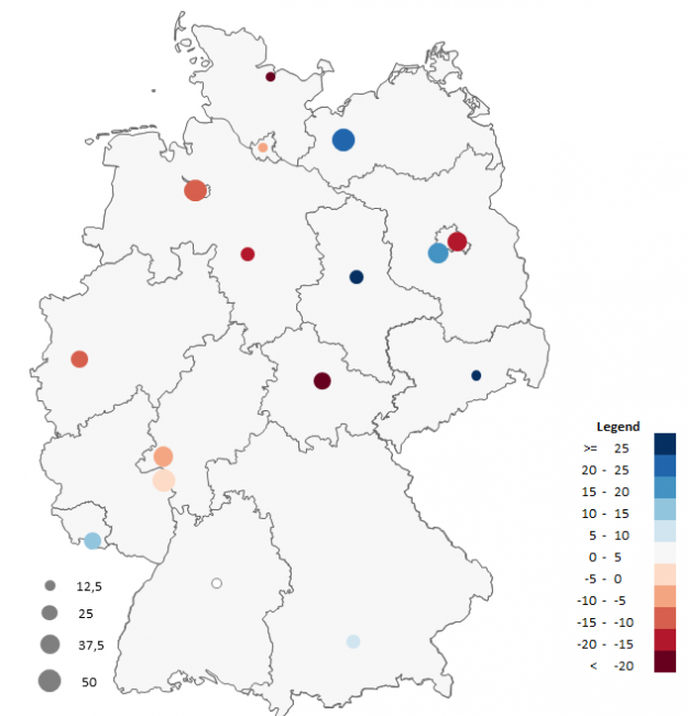
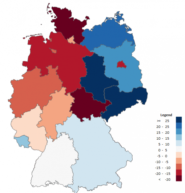
What is the problem with the filled map? You can show only 1 measure on a map at the same time. What if you would like to show two of your KPIs: the size of the sales and the target realization? Use colored bubble chart.

Bubble chart in the analysis on the map

Excel Map TutorialBy BartekMarch 11, 2013Leave a comment

Bubble chart allows to present 3 series of data at the same time – the figures are presented on the x and y-axes and by the bubble size.

Presentation of geographical data

Charts, Dashboards, Excel Map TutorialBy SkuteczneRaporty.plJanuary 21, 2011Leave a comment

Analysing data with regard to the place of occurrence of a phenomenon or process is inseparable from the cause and effect analysis.

© Copyright SkuteczneRaporty.pl 2010-2025
  • Terms and conditions
  • Demo
  • Privacy Policy
———MENU BOTTOM

Made with by FunkyBike.ART Creative Agency

Go to Top
  •  
  • Products
    • Demo
    • Credentials
  • Free Mapping Video Course
  • Trainings
    • Art of Data Visualization & Dashboard Design
    • Excel BI for Analysts
    • Data visualisation and designing dashboards in Tableau
    • Power BI – create data model, design dashboard, share report
    • Certification
  • Services
    • Excel Maps, Geoanalysis, GIS System
    • Excel reports automation & design with VBA, Query & PowerPivot
    • Power BI & Business Intelligence
    • Reports, Analyzes & Infographics
    • Credentials
  • Blog
    • Newsletter
    • Resources
  • About Me
  • Contact
Search:
Search