Skip to content
Facebook page opens in new windowLinkedin page opens in new windowYouTube page opens in new windowRss page opens in new window
Cart0

View CartCheckout

  • No products in the cart.

Subtotal: 0.00 €

View CartCheckout

Login
Cart0

View CartCheckout

  • No products in the cart.

Subtotal: 0.00 €

View CartCheckout

Login
Maps for Excel – Simple Excel Add-In to create filled maps & dashboards in Excel
Excel Map, Filled Map, Choropleth Map, Build Regions, Post Codes, Bubble Chart on Maps, Power BI
Maps for Excel - Simple Excel Add-In to create filled maps & dashboards in ExcelMaps for Excel - Simple Excel Add-In to create filled maps & dashboards in Excel
+48 500 196 861
contact@maps-for-excel.com
  •  
  • Products
    • Demo
    • Credentials
  • Free Mapping Video Course
  • Trainings
    • Art of Data Visualization & Dashboard Design
    • Excel BI for Analysts
    • Data visualisation and designing dashboards in Tableau
    • Power BI – create data model, design dashboard, share report
    • Certification
  • Services
    • Excel Maps, Geoanalysis, GIS System
    • Excel reports automation & design with VBA, Query & PowerPivot
    • Power BI & Business Intelligence
    • Reports, Analyzes & Infographics
    • Credentials
  • Blog
    • Newsletter
    • Resources
  • About Me
  • Contact
Search:
Search
Search:
Search
Search:
Search
Maps for Excel - Simple Excel Add-In to create filled maps & dashboards in ExcelMaps for Excel - Simple Excel Add-In to create filled maps & dashboards in Excel
  •  
  • Products
    • Demo
    • Credentials
  • Free Mapping Video Course
  • Trainings
    • Art of Data Visualization & Dashboard Design
    • Excel BI for Analysts
    • Data visualisation and designing dashboards in Tableau
    • Power BI – create data model, design dashboard, share report
    • Certification
  • Services
    • Excel Maps, Geoanalysis, GIS System
    • Excel reports automation & design with VBA, Query & PowerPivot
    • Power BI & Business Intelligence
    • Reports, Analyzes & Infographics
    • Credentials
  • Blog
    • Newsletter
    • Resources
  • About Me
  • Contact
Cart0

View CartCheckout

  • No products in the cart.

Subtotal: 0.00 €

View CartCheckout

Login

Tag Archives: video tutorial

You are here:
  1. Home
  2. Entries tagged with "video tutorial"

3 ways to count filled map ranges in Excel Map United Kingdom

Excel Map TutorialBy BartekMay 17, 2017Leave a comment

Using filled (choropleth maps) may be a little tricky. Every time you change the color range values you get a different map. That is why it is crucial to choose a proper method to define the legend ranges. You can find here three most common ways.

How to build your own regions & areas? – Example for Excel Map France Postcodes (Code Postal)

Excel Map TutorialBy BartekMay 17, 2017Leave a comment

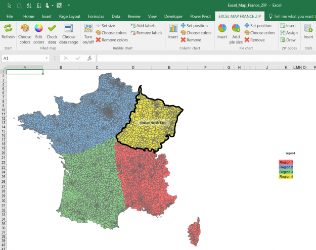
Filled map functionality of the Excel Map allows user not only to differentiate the shapes colors by values (which is sometimes called a choropleth map) but also to color them by categories. Using Excel Map France Postcodes (Code Postal) I will show you how to create your own regions.

© Copyright SkuteczneRaporty.pl 2010-2025
  • Terms and conditions
  • Demo
  • Privacy Policy
———MENU BOTTOM

Made with by FunkyBike.ART Creative Agency

Go to Top
  •  
  • Products
    • Demo
    • Credentials
  • Free Mapping Video Course
  • Trainings
    • Art of Data Visualization & Dashboard Design
    • Excel BI for Analysts
    • Data visualisation and designing dashboards in Tableau
    • Power BI – create data model, design dashboard, share report
    • Certification
  • Services
    • Excel Maps, Geoanalysis, GIS System
    • Excel reports automation & design with VBA, Query & PowerPivot
    • Power BI & Business Intelligence
    • Reports, Analyzes & Infographics
    • Credentials
  • Blog
    • Newsletter
    • Resources
  • About Me
  • Contact
Search:
Search