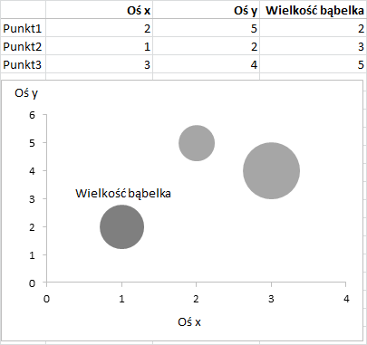
 Bubble chart allows to present 3 series of data at the same time – the figures are presented on the x and y-axes and by the bubble size.
Presentation of a point in bi-dimensional space on both axes allows to compare two points precisely and is understood rather intuitively, more so as the bubble chart is usually accompanied by visible axes. It is difficult to estimate the bubble area, as comparing two elements we can easily say which one is bigger, but it is more difficult to say how much bigger. In this respect using bubbles is slightly risky and requires that data be made available on request.
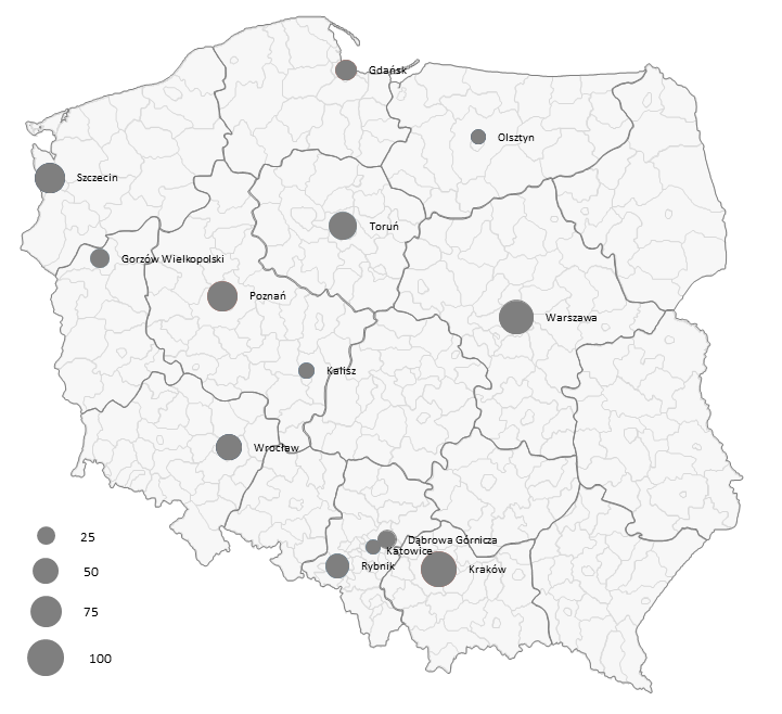
If we replace the series x and y with geographic coordinates of points (e.g. company’s divisions), the third series of data can be used to present figures concerning those places (e.g. sales), and the whole is placed against the background of the map, we will receive a bubble chart on the map. It allows to analyse only one same-sign series of data (either positive or negative numbers), e.g. revenues, costs, number of orders, number of customers, etc. If the points overlap it is recommended that they be separated by a slight correction of coordinates.
A diagram prepared this way allows to analyse data in relation to the place of their origin, thus extending the range of analytic possibilities. First of all, we will see how far from each other are the points and notice whether there are places where points are concentrated in one place or whether there are gaps. Second of all, we can relate the results to regional differences – closeness to other markets (German, Czech or Russian), competition in a given area or data available on the Internet or at the Central Statistical Office (number of inhabitants, their incomes, or other data characteristic of a given market, e.g. in a construction sector – the number of acquired building permits).
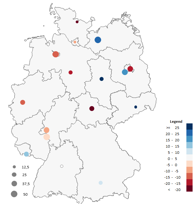
A bubble chart can be enhanced with an additional series of data that will be represented by a colour on a sequential colour scheme (one colour of changing intensity) or a diverging colour scheme (two colours of changing intensity). Understanding how this type of chart works requires some time but when learned, it leaves at our disposal the analysis of relations between two series of data, where a series in one colour can have both, positive and negative values.
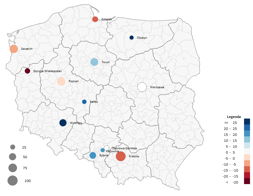
Let us assume that we want to check the relation of sales results of divisions spread throughout Poland to their operational results (calculated as a difference between revenues and costs). Sales revenues will be presented as bubbles and operational results as bubble colour. How to read such a chart? The bigger the bubble, the higher the sales at a given division. Blue colour stands for positive operational result (profit), red colour stands for a negative result (loss). The more intensive the colour, the higher the profit or loss.
First we should focus on the large bubbles, as those represent the biggest divisions of key importance for the company. Big blue bubbles stand for profitable divisions (“cash cows”), big red bubbles stand for divisions that are not profitable despite their high turnovers. The analysis should be focused on the latter: how many of them, where are they, what are the reasons for their results.
In summary, a bubble chart on a map is a tremendous analytic tool and can be used by companies and organizations of any specialization.
The bubble chart is available with all the maps of Poland in the Products section.


