Skip to content
Facebook page opens in new windowLinkedin page opens in new windowYouTube page opens in new windowRss page opens in new window
Cart0

View CartCheckout

  • No products in the cart.

Subtotal: 0.00 €

View CartCheckout

Login
Maps for Excel – Simple Excel Add-In to create filled maps & dashboards in Excel
Excel Map, Filled Map, Choropleth Map, Build Regions, Post Codes, Bubble Chart on Maps, Power BI
Maps for Excel - Simple Excel Add-In to create filled maps & dashboards in ExcelMaps for Excel - Simple Excel Add-In to create filled maps & dashboards in Excel
+48 500 196 861
contact@maps-for-excel.com
  •  
  • Products
    • Demo
    • Credentials
  • Free Mapping Video Course
  • Trainings
    • Art of Data Visualization & Dashboard Design
    • Excel BI for Analysts
    • Data visualisation and designing dashboards in Tableau
    • Power BI – create data model, design dashboard, share report
    • Certification
  • Services
    • Excel Maps, Geoanalysis, GIS System
    • Excel reports automation & design with VBA, Query & PowerPivot
    • Power BI & Business Intelligence
    • Reports, Analyzes & Infographics
    • Credentials
  • Blog
    • Newsletter
    • Resources
  • About Me
  • Contact
Search:
Search
  •  
  • Products
    • Demo
    • Credentials
  • Free Mapping Video Course
  • Trainings
    • Art of Data Visualization & Dashboard Design
    • Excel BI for Analysts
    • Data visualisation and designing dashboards in Tableau
    • Power BI – create data model, design dashboard, share report
    • Certification
  • Services
    • Excel Maps, Geoanalysis, GIS System
    • Excel reports automation & design with VBA, Query & PowerPivot
    • Power BI & Business Intelligence
    • Reports, Analyzes & Infographics
    • Credentials
  • Blog
    • Newsletter
    • Resources
  • About Me
  • Contact

Tag Archives: bubble chart Excel

You are here:
  1. Home
  2. Entries tagged with "bubble chart Excel"

How to design a flow map for logistics with Excel Map?

Excel Map TutorialBy BartekJune 16, 20173 Comments

If you are trying to analyze what is going on in your logistics, you might need the flow map that will show where your distribution centers are and where you send your products to. With Excel Map it’s really easy to customize a map like this to show with arrows the direction of your flow.

How to change the bubble shape into a logo?

Excel Map TutorialBy BartekJune 16, 2017Leave a comment

Sometimes you may want to attract the audience with a non-standard map. One of the ways to do it is to use a graphic instead of clean data visualization like bubbles. With Excel Map you can easily replace the bubble shape with an image.

How to geocode customer addresses and show them on an Excel bubble chart?

Excel Map TutorialBy BartekJune 16, 2017Leave a comment

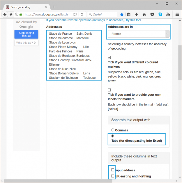
If your data contains addresses (or just part of it like city or post code) you can try to show the data on the map. Although Excel Map does not support zoom in like Google Maps or any other Internet map do, it can give you an overview on where your addresses are (e.g. of…

2 ways to filter the bubble chart on Excel Map

Excel Map TutorialBy BartekJune 16, 2017Leave a comment

There are two ways to create a quick filter for the bubble chart layer in the Excel Map: if you are Excel 2013+ user, you can create a slicer or you can create a non-standard filter based on your list.

How to show 2 measures on the map?

Excel Map TutorialBy BartekJune 16, 2017Leave a comment

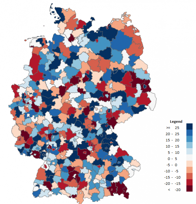
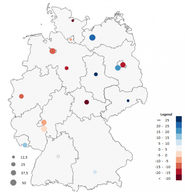
What is the problem with the filled map? You can show only 1 measure on a map at the same time. What if you would like to show two of your KPIs: the size of the sales and the target realization? Use colored bubble chart.

TOP 4 uses of our Excel Maps

Excel Map TutorialBy BartekMay 16, 2013Leave a comment

Customers of Maps-for-Excel.com use our Excel maps in many ways. Here are the 4 most useful of them (examples based on the Excel Map of Poland).

Bubble chart in the analysis on the map

Excel Map TutorialBy BartekMarch 11, 2013Leave a comment

Bubble chart allows to present 3 series of data at the same time – the figures are presented on the x and y-axes and by the bubble size.

© Copyright SkuteczneRaporty.pl 2010-2020
  • Terms and conditions
  • Demo
  • Privacy Policy
MENU BOTTOM

Made with by FunkyBike.ART Creative Agency

Go to Top