Skip to content
Facebook page opens in new windowLinkedin page opens in new windowYouTube page opens in new windowRss page opens in new window
Cart0

View CartCheckout

  • No products in the cart.

Subtotal: 0.00 €

View CartCheckout

Login
Cart0

View CartCheckout

  • No products in the cart.

Subtotal: 0.00 €

View CartCheckout

Login
Maps for Excel – Simple Excel Add-In to create filled maps & dashboards in Excel
Excel Map, Filled Map, Choropleth Map, Build Regions, Post Codes, Bubble Chart on Maps, Power BI
Maps for Excel - Simple Excel Add-In to create filled maps & dashboards in ExcelMaps for Excel - Simple Excel Add-In to create filled maps & dashboards in Excel
+48 500 196 861
contact@maps-for-excel.com
  •  
  • Products
    • Demo
    • Credentials
  • Free Mapping Video Course
  • Trainings
    • Art of Data Visualization & Dashboard Design
    • Excel BI for Analysts
    • Data visualisation and designing dashboards in Tableau
    • Power BI – create data model, design dashboard, share report
    • Certification
  • Services
    • Excel Maps, Geoanalysis, GIS System
    • Excel reports automation & design with VBA, Query & PowerPivot
    • Power BI & Business Intelligence
    • Reports, Analyzes & Infographics
    • Credentials
  • Blog
    • Newsletter
    • Resources
  • About Me
  • Contact
Search:
Search
Search:
Search
Search:
Search
Maps for Excel - Simple Excel Add-In to create filled maps & dashboards in ExcelMaps for Excel - Simple Excel Add-In to create filled maps & dashboards in Excel
  •  
  • Products
    • Demo
    • Credentials
  • Free Mapping Video Course
  • Trainings
    • Art of Data Visualization & Dashboard Design
    • Excel BI for Analysts
    • Data visualisation and designing dashboards in Tableau
    • Power BI – create data model, design dashboard, share report
    • Certification
  • Services
    • Excel Maps, Geoanalysis, GIS System
    • Excel reports automation & design with VBA, Query & PowerPivot
    • Power BI & Business Intelligence
    • Reports, Analyzes & Infographics
    • Credentials
  • Blog
    • Newsletter
    • Resources
  • About Me
  • Contact
Cart0

View CartCheckout

  • No products in the cart.

Subtotal: 0.00 €

View CartCheckout

Login

Category Archives: Excel Map Tutorial

You are here:
  1. Home
  2. Category "Excel Map Tutorial"

How to drill down on Excel Map France?

Excel Map TutorialBy BartekJune 16, 2017Leave a comment

If the map has two administrative levels (like Excel Map France, where there are Regions and Departments) you can easily drill down and up between these levels using Hide shapes functionality. The example will be based on the population data for France.

How to classify your data on a filled map (choropleth map)? Population on Excel Map France

Excel Map TutorialBy BartekJune 16, 2017Leave a comment

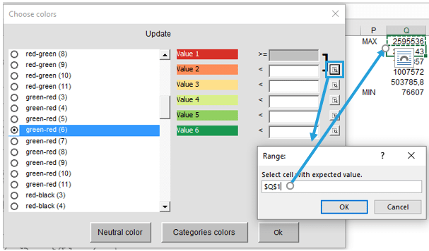
The most important decision to be made when designing a filled map (professionally called a choropleth map) is to define colors classes. As the designer, you decide which value goes to which color. Your decision will have a great impact on what the audience will get from your map. Get to know 3 ways to…

How to show regional results on custom regions? (Example for France Departments)

Excel Map TutorialBy BartekJune 16, 2017Leave a comment

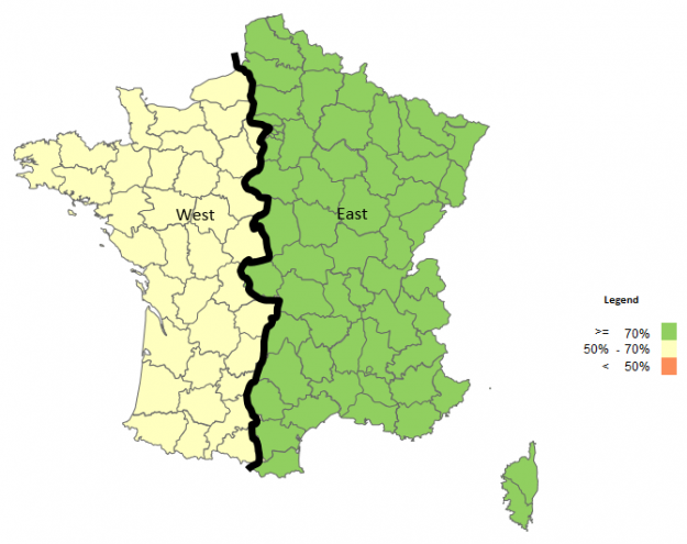
In the previous tutorial, we’ve ended up with a custom regions map. Now let’s use it to show how well our regions meet corporate KPIs.

How to build custom regions in Excel Map? – Example for France Departments

Excel Map TutorialBy BartekJune 16, 2017Leave a comment

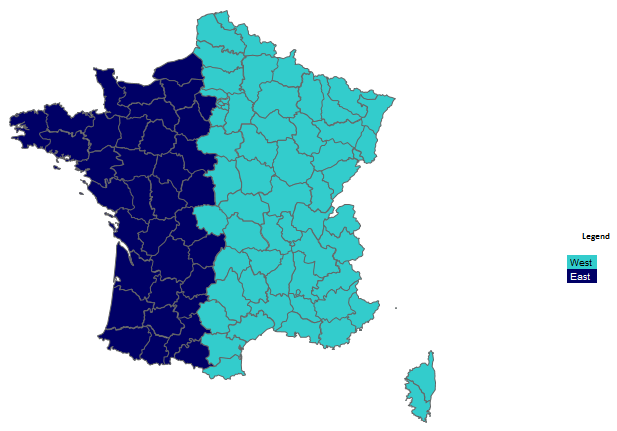
Excel Map is extremely flexible when it comes to designing custom regions. When your regional division is based on administrative areas or ZIP codes, you can use our Excel Map to quickly show the regions, draw the boundaries and add any labels on top.

3 ways to count filled map ranges in Excel Map United Kingdom

Excel Map TutorialBy BartekMay 17, 2017Leave a comment

Using filled (choropleth maps) may be a little tricky. Every time you change the color range values you get a different map. That is why it is crucial to choose a proper method to define the legend ranges. You can find here three most common ways.

How to build your own regions & areas? – Example for Excel Map France Postcodes (Code Postal)

Excel Map TutorialBy BartekMay 17, 2017Leave a comment

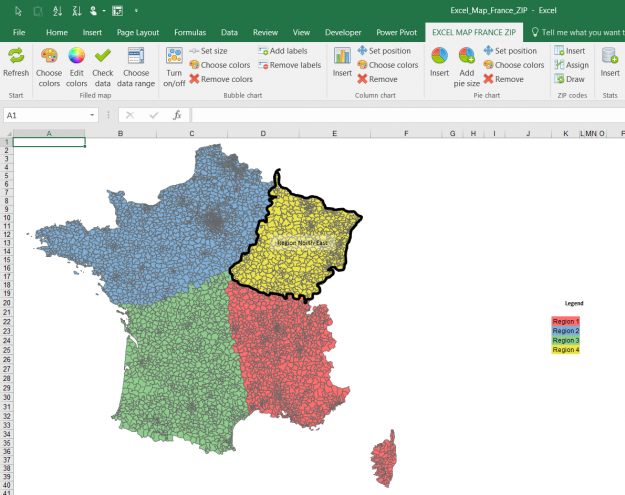
Filled map functionality of the Excel Map allows user not only to differentiate the shapes colors by values (which is sometimes called a choropleth map) but also to color them by categories. Using Excel Map France Postcodes (Code Postal) I will show you how to create your own regions.

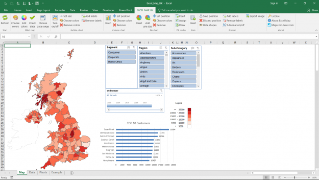
How to create an interactive Excel dashboard with slicers? – Example for Excel Map UK

Excel Map TutorialBy BartekMay 17, 20171 Comment

A dashboard is usually a collection of charts and tables combined with interactivity for the end user. Excel Map software allows the user to easily create interactive dashboards using pivot tables and slicers. This example is based on a Excel Map UK but can be applied to any of the maps.

TOP 4 uses of our Excel Maps

Excel Map TutorialBy BartekMay 16, 2013Leave a comment

Customers of Maps-for-Excel.com use our Excel maps in many ways. Here are the 4 most useful of them (examples based on the Excel Map of Poland).

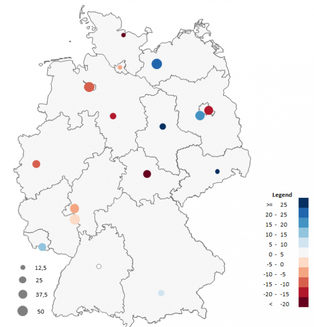
Bubble chart in the analysis on the map

Excel Map TutorialBy BartekMarch 11, 2013Leave a comment

Bubble chart allows to present 3 series of data at the same time – the figures are presented on the x and y-axes and by the bubble size.

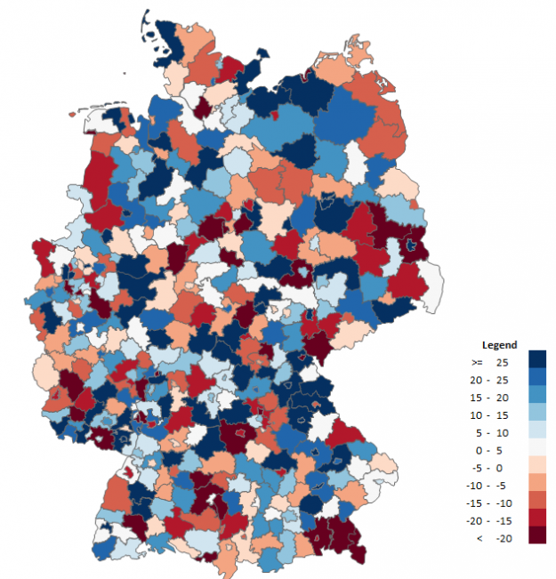
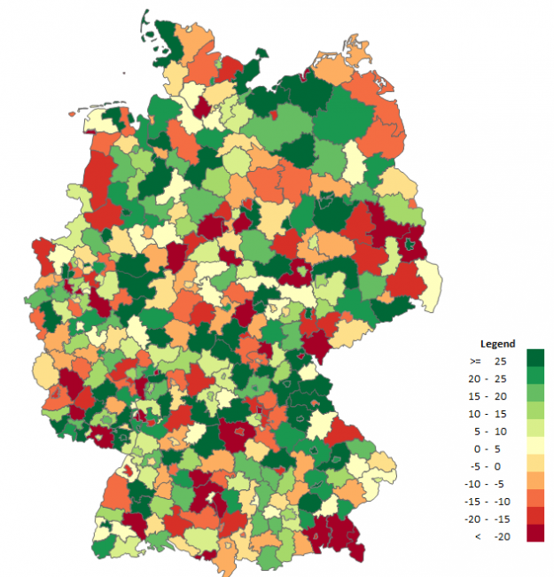
Choropleth map in the analysis on the map

Excel Map TutorialBy BartekMarch 11, 20131 Comment

The choropleth map is a chart presenting phenomena on the map and is one of quantitative methods in cartography. Intensity of a given phenomenon is displayed within defined reference areas, the most often of administrative division, e.g. provinces, municipalities/communes or districts, and the magnitude of the phenomenon is presented in classes (ranges).

←123456→
© Copyright SkuteczneRaporty.pl 2010-2025
  • Terms and conditions
  • Demo
  • Privacy Policy
———MENU BOTTOM

Made with by FunkyBike.ART Creative Agency

Go to Top
  •  
  • Products
    • Demo
    • Credentials
  • Free Mapping Video Course
  • Trainings
    • Art of Data Visualization & Dashboard Design
    • Excel BI for Analysts
    • Data visualisation and designing dashboards in Tableau
    • Power BI – create data model, design dashboard, share report
    • Certification
  • Services
    • Excel Maps, Geoanalysis, GIS System
    • Excel reports automation & design with VBA, Query & PowerPivot
    • Power BI & Business Intelligence
    • Reports, Analyzes & Infographics
    • Credentials
  • Blog
    • Newsletter
    • Resources
  • About Me
  • Contact
Search:
Search