In the previous tutorial, we’ve ended up with a custom regions map. Now let’s use it to show how well our regions meet corporate KPIs.
Preparing data for showing regional KPIs on Excel Map France
We will use the same data structure as in the previous example, but now I will modify the region numbers table. Instead of region number let’s put there KPI value. This simple example is based on two regions only but of course you can have many more.

This tiny table is connected by VLOOKUP function to the Data sheet and therefore to the map.
Showing regions results with traffic lights
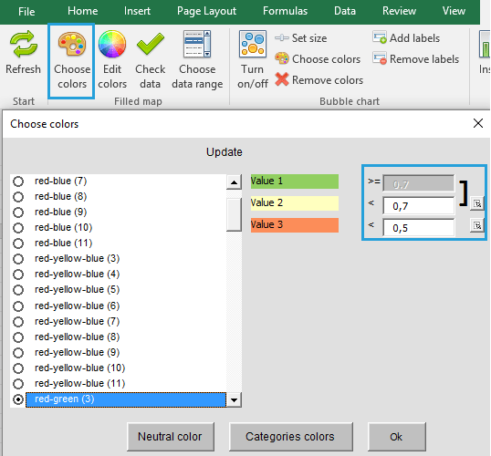
Now let’s use built-in color palettes to show results as colors. Go to Choose colors > pick red-green palette and assign KPI levels.

Adding percentage formatting to map legend
If your KPI is formatted as percentage, you can turn on percentage formatting on Excel Map ribbon.

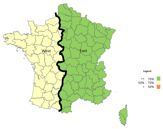
This is our final KPI map:


