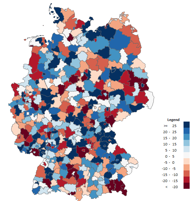
 Customers of Maps-for-Excel.com use our Excel maps in many ways. Here are the 4 most useful of them (examples based on the Excel Map of Poland).
1. Analysis of the results of sales networks divided into regions, territories and areas
Customers: nationwide companies with extensive sales networks (regions, areas, territories) and their own territorial division
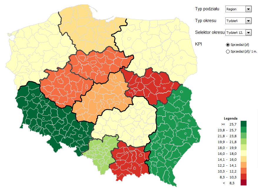
Example: One of the Customers of Maps-for-Excel.com started the Map in Excel divided into districts to show everyday reports of sales results. The Customer superimposed on the map the natural division of their company: regions, sales areas and territories of individual sales representatives. They selected the choropleth map in red and green colour scheme for their presentation. The dark green areas are the places on their map where the results are the best (in PLN), the dark red being the worst. The data comes from reports prepared by sales representatives. In order to extend the analysis the Customer used the filter of days, weeks and months and added the indicator of sales/1 inhabitant using the data from the Central Statistical Office tab.
2. Distribution analysis with postal codes
Customers: companies selling their products through numerous retail outlets (e.g. the markets of FMCG, cosmetics, pharmaceuticals or construction materials).
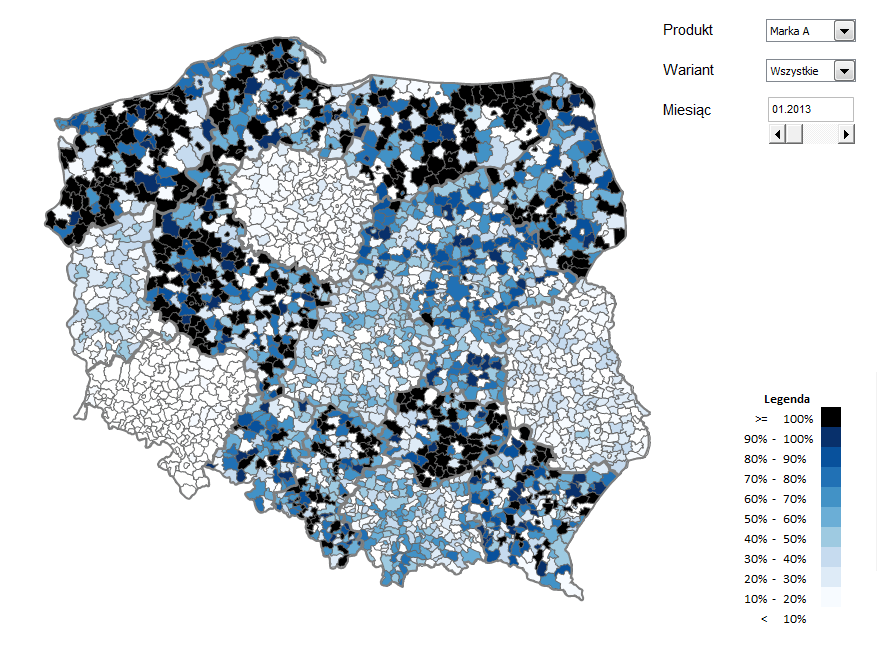
Example: A company from the FMCG sector uses the Map in Excel divided into communes and municipalities to analyse distribution of its products at retail outlets (understood as the presence of the product at the outlet). The data comes from an IT system and is gathered by representatives during their monthly visits at the outlets. The Customer expanded the map by a product filter and enabled selection of a month. The data is aggregated to the level of a commune/municipality by postal codes and then numeric distribution is calculated (the number of outlets where the product is present/the number of visited outlets). The presentation uses the choropleth map with the hues of blue.
3. Analysis of market penetration and searching for areas with potential for sales
Customers: companies selling products through numerous retail outlets (e.g. the markets of FMCG, cosmetics, pharmaceuticals or construction materials).
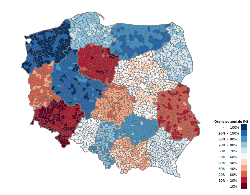
Example: The company from the second example went one step further with their analysis and used the number of inhabitants and their retail buying power for every commune/municipality. This way a map was created that defines areas of potential sales development – where many people with high income live and the distribution of a product is low. Commercial activities were intensified in such areas (more frequent visits by sales representatives and special sales supporting programmes, among others).
4. A double-indicator analysis of divisions
Customers: companies with many divisions or retail outlets of their own spread throughout the country (e.g. commercial networks, nationwide warehouses, dairy, automotive and financial markets).
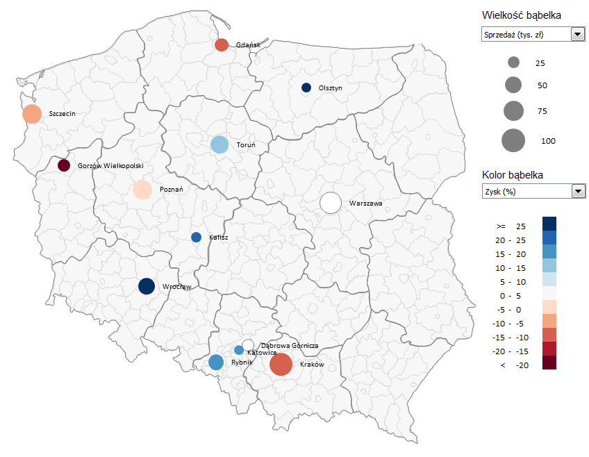
Example: A company from automotive sector uses an advanced bubble chart from the Map in Excel divided into provinces to analyse its several dozen divisions for basic financial indicators: sales revenues, costs, profit, profit (%), execution of the sales plan (%). The advanced bubble chart allows to compare two variables at the same time, e.g. sales revenues (as the bubble size) and execution of the sales plan (%) (as the bubble colour). The company uses the default red and blue colour scheme, which means that large dark blue bubbles stand for high revenues and high percentage of plan execution, small dark blue bubbles for low revenues and high percentage of plan execution, large dark red bubbles for high revenues and low percentage of plan execution, and small dark red for low revenues and low percentage of plan execution. In the same way all other indicators are analysed in many combinations. This type of analysis allows to understand better which environment characteristics influence the indicators the most and is the basis for decision concerning expanding or changing the location of outlets.


