Based on our Excel Maps for different countries we’ve just released a brand new map called Custom Excel Map. This map allows you to design your own shapes and work with them with colors, bubbles, column charts and pie charts. It enables creating a map that you need – for your factory, warehouse, custom map of your regional division, office, process map (like in MS Visio) and any other map that you imagine. The map can be found on our online store with Excel maps and delivered to you in 24 hours.
How to design your own map?
This example is based on a scenario realized for one of our customers. We got a factory layout and were asked to design an Excel map for reporting purposes. This is how you can create a map for yourself.
Watch video tutorial
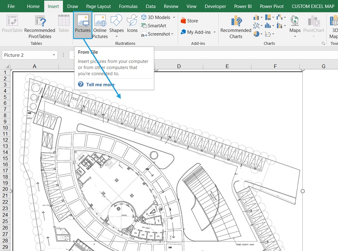
Step 1: Load an image into Excel
You start with a basic image of the factory (if you don’t have any, you can draw it from scratch).
Step 2: Draw and rename shapes
Using standard Excel functionalities you can now draw any shapes on top of your map. These may be rectangles, squares, arrows, circles, freeform shapes or even custom shapes that you can scribble.
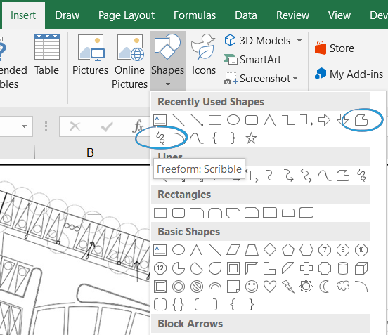
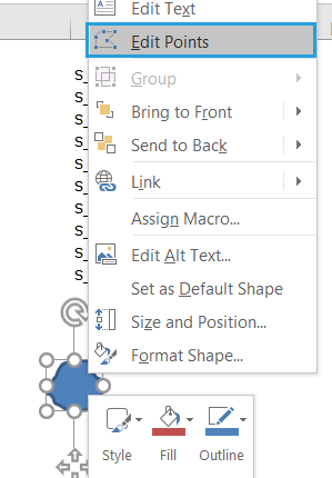
Keep in mind that all the shapes should represent close path to make it possible for the map to color the interior of the shape. If your custom shape will not look as expected, you can always use Edit points option – just right click the shape.
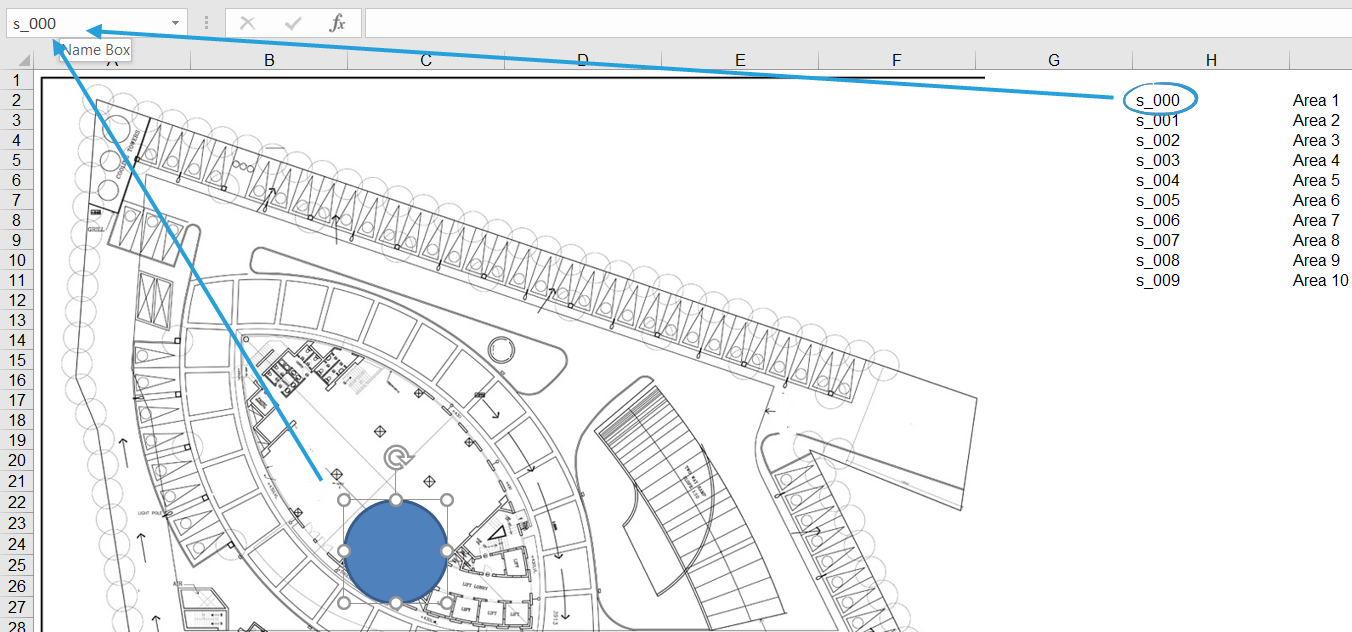
Whenever you create a shape, change its name in the top left corner of the sheet (Name Box) to the required name, starting from s_000 (the first shape), s_001, s_002 etc. So the first shape is s_000 and is my Area 1 and I just go to the Name Box and rename the shape.
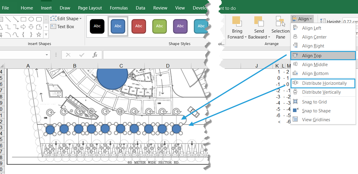
If your shapes require alignment, you can find many helpful options on Format tab, like: Align Top or Distribute Horizontally.
Step 3: Paste you shape names into the Data sheet
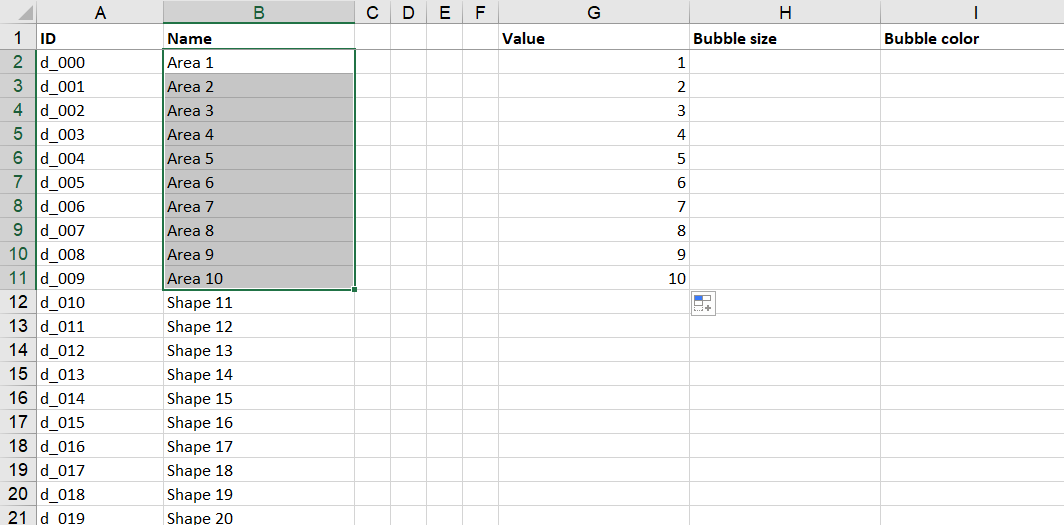
The Data sheet is responsible for coloring mechanism. It allows you to assign values to the shapes. At the beginning you need to fill names of your shapes in this sheet and insert a value for it in the G column of the Data sheet (the name can go anywhere from B to F).
Step 4: Check completeness of your shapes
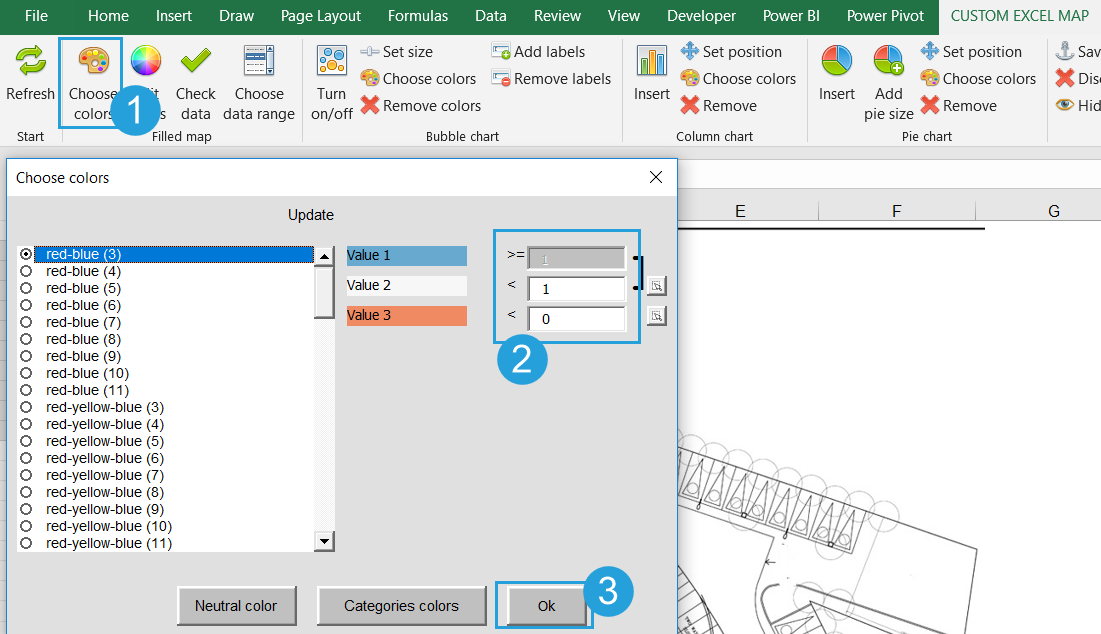
When you hit Choose colors on the Custom Excel Map ribbon, you will be able to check if the shapes are complete. Just insert any numbers in the G column of the Data sheet and any numbers for coloring mechanism.
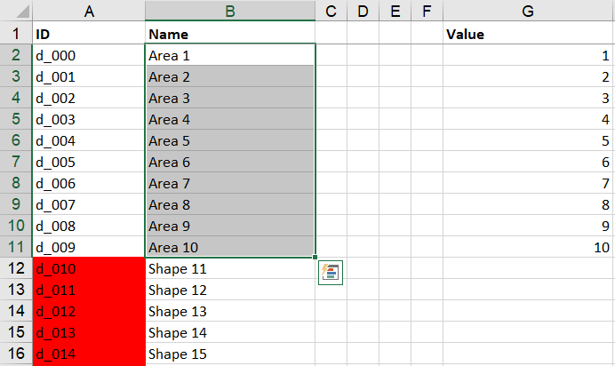
If everything will go fine, none of your shape numbers in the Data sheet will become red.
Step 5: Design a dashboard with your map
The last part depends on you. You can create many additional things to your map using the standard features of our software like:
Color the shapes by numbers
Assign any numbers to your shapes to show values using different color legends. You can also create your own color legend.
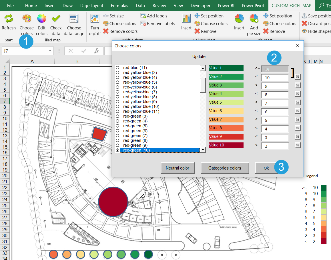
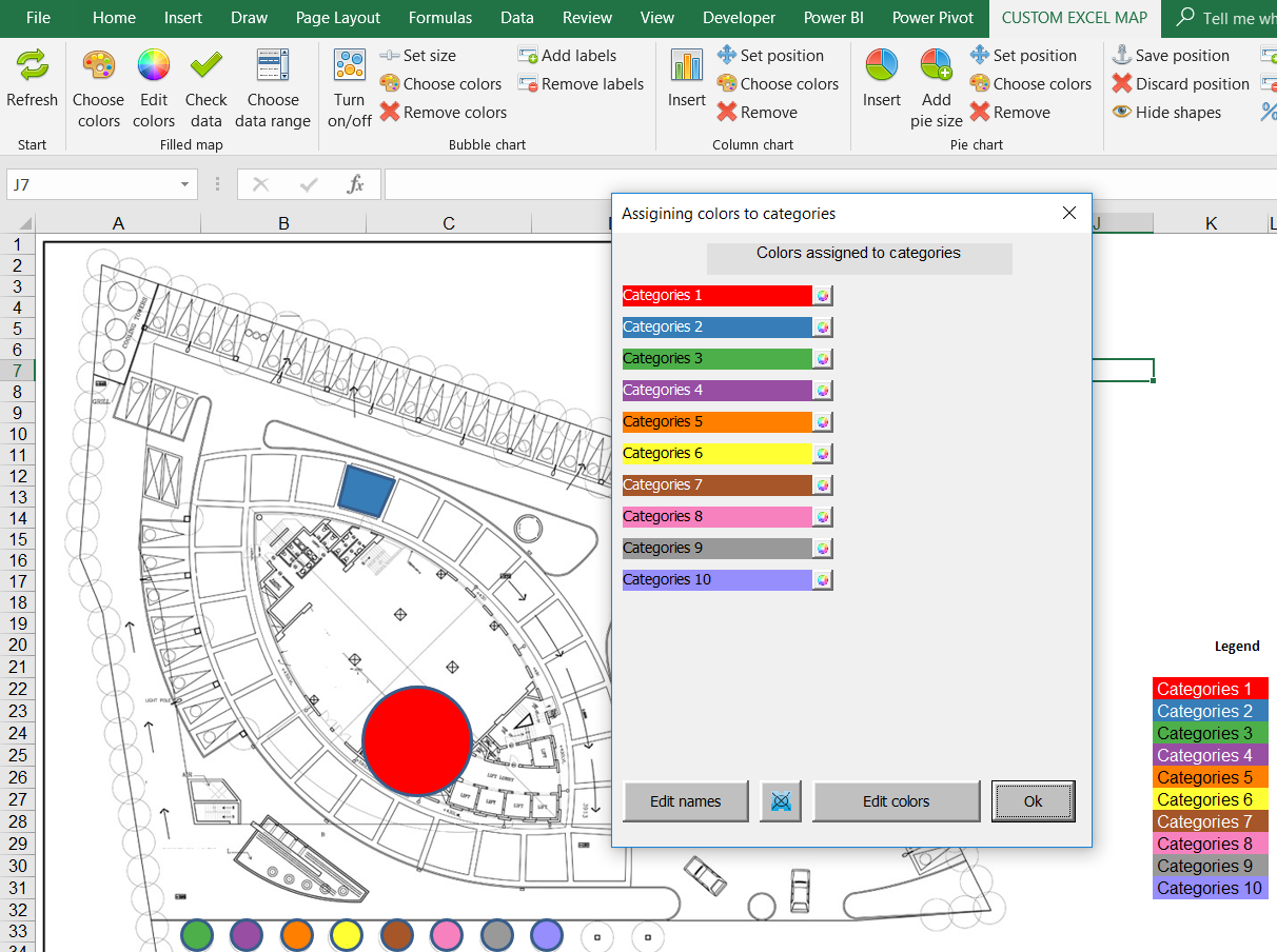
Color the shapes by category
Assign numbers from 1 to 30 to group the shapes into color categories
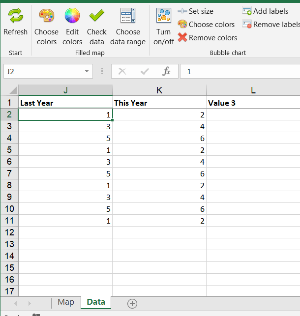
Create a column chart or a pie chart
Fill-in the data in J:S columns in the Data sheet and create column chart or pie chart
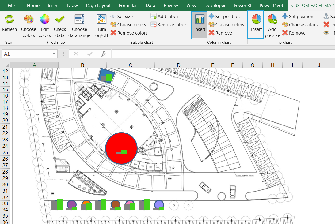
Create bubble chart, labels, add your own labels, design a chart with slicers
There are many other options that can be found in the custom map. One of the most important things is that the map is inside your Excel file and can be shared easily with your colleagues. There are also many options to use pivot tables with slicers to design an interactive report with filtering options and other charts interconnected. Feel free to ask us for help in this area as we love designing useful dashboards.


very clear and good article easy to understand. Thank you