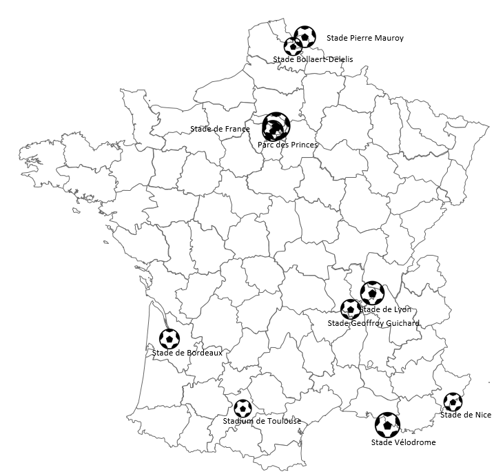
Sometimes you may want to attract the audience with a non-standard map. One of the ways to do it is to use a graphic instead of clean data visualization like bubbles. With Excel Map you can easily replace the bubble shape with an image.
Prepare the bubble chart
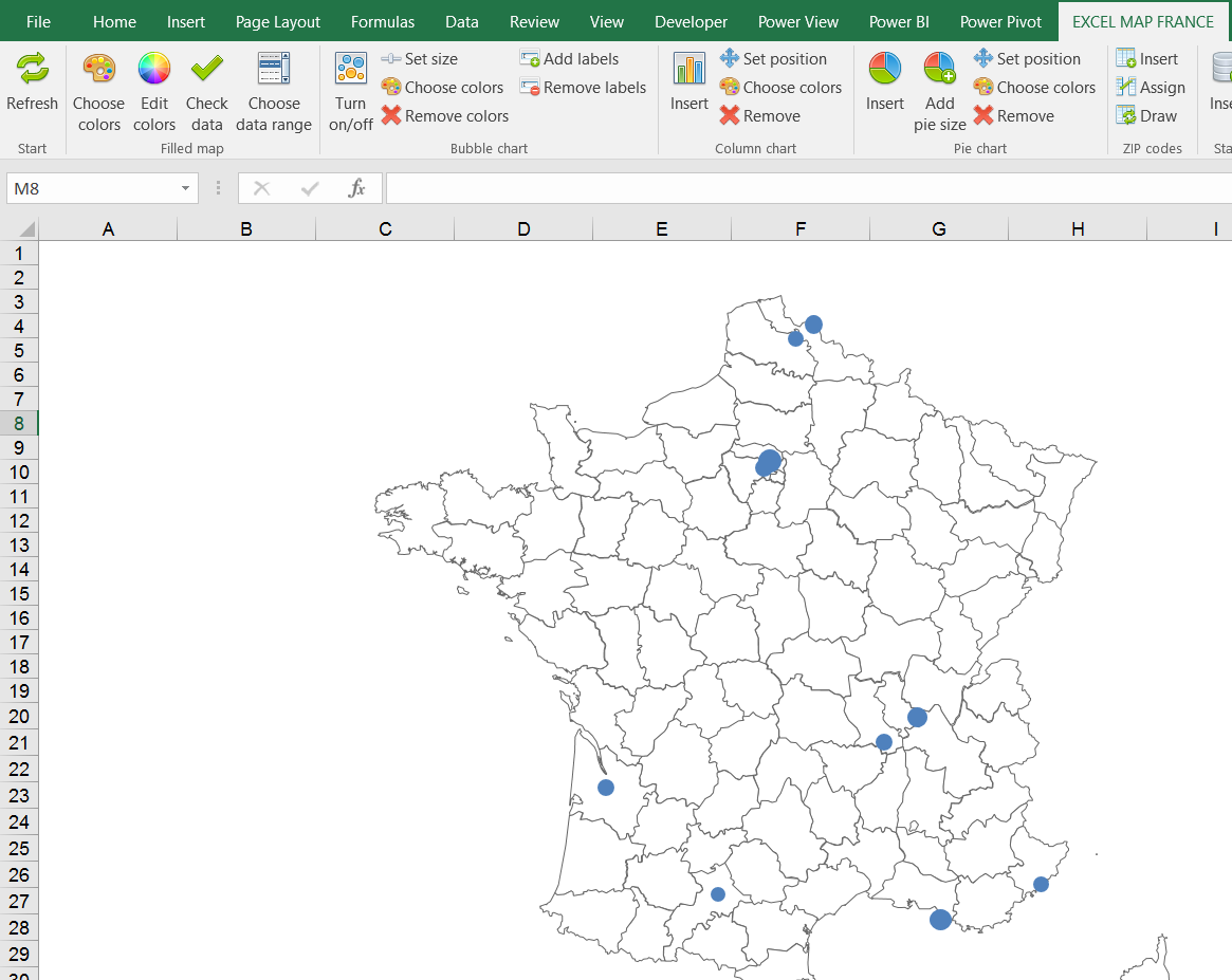
To use this technique you need to create a bubble chart with Excel Map. My example is based on the previous article on how to geocode addresses. I’ve shown on the France map where Euro 2016 stadiums were located.

Prepare the image
Then you need to prepare an image directly in Excel. It might be a logo or a graphic file. You can use the newest option of Office 365 which is icons.

Paste the image as chart icon
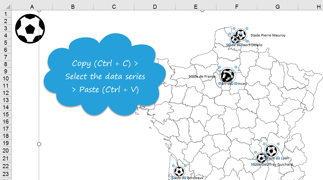
Copy the image (Ctrl + C) > select the chart series > Paste (Ctrl + V).


