What is the problem with the filled map? You can show only 1 measure on a map at the same time. What if you would like to show two of your KPIs: the size of the sales and the target realization? Use colored bubble chart.
Prepare the data for the KPI map
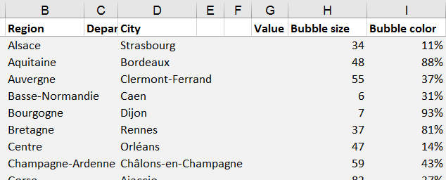
Whereas column G in the Data sheet is very useful, let’s try to use the next columns: H and I of the same sheet – to generate a dual KPI chart.

The Bubble size column should give you an overview, how important something is, like for how much of sales does the region account. The Bubble color column is responsible for giving you a sign if it’s good or bad.
Show your data on the map
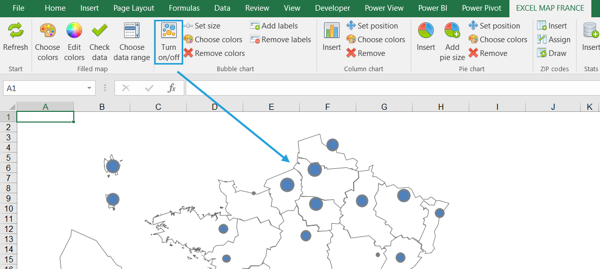
Turn on the Bubble chart on the Excel Map tab.

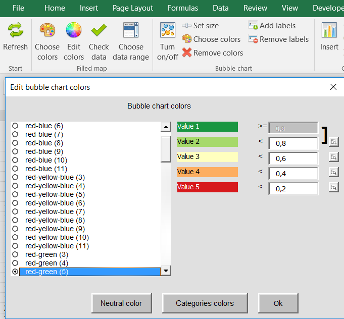
Then go to Choose colors – but this time for Bubble chart coloring – and select the bubble chart ranges (classes).

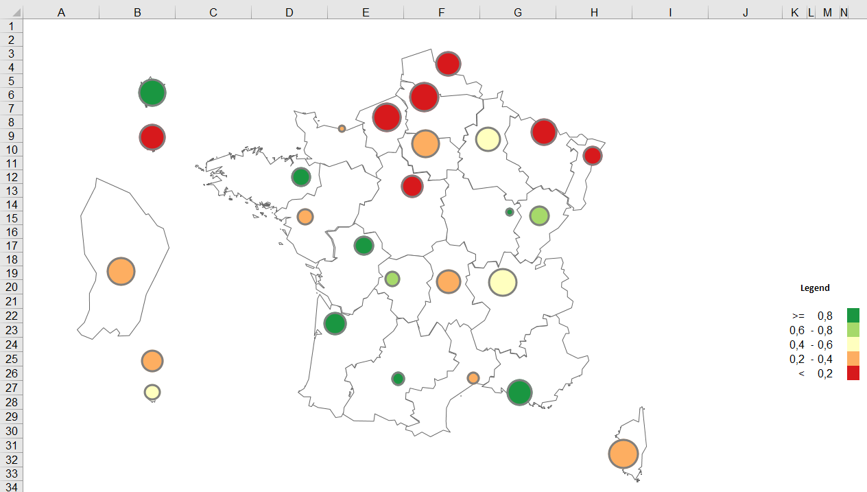
After you hit OK you will get an overview on two KPIs on the map.


